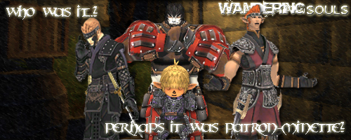
I did 95% of what you asked with relative ease.
I agree that after trying, the names are not necessary and do take up too much space, so it is fine as it is.
The only thing that I have to disagree is putting them spaced out equally. As a student of art I have to HIGHLY recommend that the galka and the tarutaru not be placed in the line, because whoever sees the sig will automatically be drawn to the galka because of its weight in the picture. By putting the galka in the middle it does not necessarilly make him the focus, but it weighs the sig evenly and makes the eye look at the whole. To counter this I made the taru slightly larger and added more of him, and gave him a shadow so he did not blend in with the galka as easilly.
Besides this everything was edited as you requested. Let me know whats up.


